
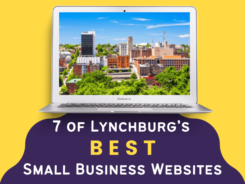
Lynchburg is home to many things including beautiful landscapes, great places to eat, a rich historical background, and a thriving community of small businesses. But did you know that Lynchburg is also home to some amazing digital works of art? I’m talking about websites, of course.
Behind a few of Lynchburg’s most reputable businesses are some websites that are borderline works of art. Ok, that may be pushing it. But from a web designer’s point of view, these sites definitely stand out as being among the best in the Hill City.
In today’s blog post, we’re going to be looking at 7 of Lynchburg’s best small business websites. I’m going to tell you why they work, what I like about them, and what they could do better.
Let’s get started.
#1 Animal Emergency & Critical Care
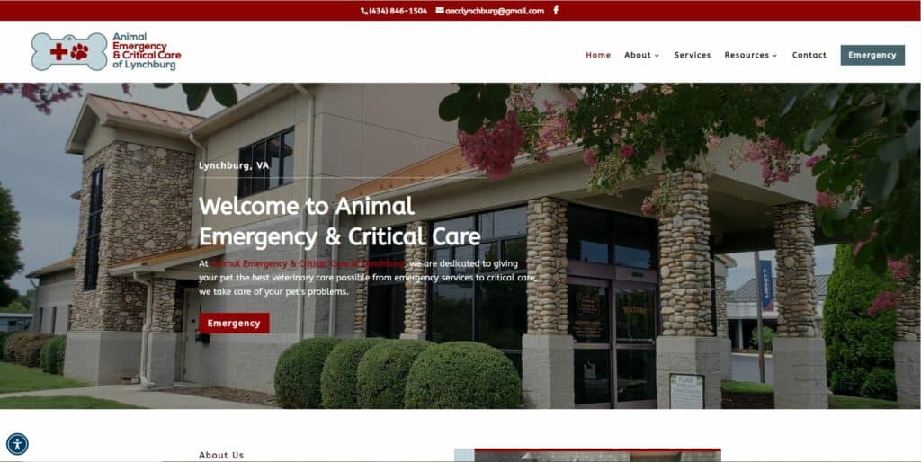
The Animal Emergency & Critical Care website is clean, easy to navigate, and professional. Its homepage is laid out perfectly with all its relevant information neatly organized and separated into sections. This makes it easy for site visitors to find what they’re looking for quickly.
Its consistent color scheme, font combination, and subtle hover animations give this website a modern, custom feel that fits well within its industry. They’ve included a Google Map at the bottom of the page that makes it easy for visitors to get directions when needed, and their click-to-call Emergency button makes it super convenient for people to reach them in the event of an emergency.
Overall I’d say this website is a solid representation of what any veterinarian / animal care website should look like.
- This site is powered by WhiskerCloud.
- Visit Animal Emergency & Critical Care.
#2 Central Virginia Orthodontics
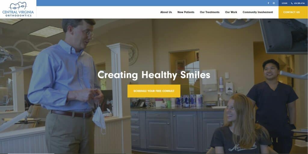
This website makes use of a video background in its hero section which I love. Having video content on your website adds a bit of dynamism that can’t be obtained via text or static images. They’ve done a good job of incorporating relevant footage that really helps site visitors connect with them.
Their H1 title, “Creating Healthy Smiles”, is relevant, to the point, and immediately connects with their target audience. Throughout the site, they use different shades of blue which feels calming and professional. They also have lots of great, relevant images throughout the homepage of their doctors, the office itself, and previous patients. This really helps site visitors get a feel for the practice and who they’ll be doing business with in a way that stock photos can’t.
Central Virginia Orthodontics did a great job with my braces back in 2005ish and they’ve done a phenomenal job with their current website! It looks amazing.
#3 Tier 1 Performance & Chiro
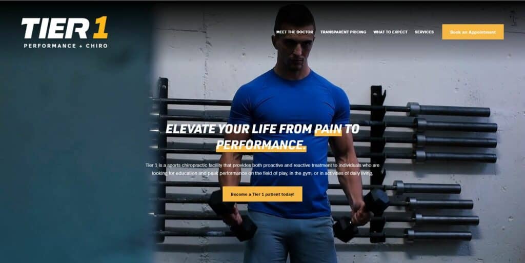
One of the things I really love about this website is the black and yellow color scheme they’ve chosen. It’s bold, powerful, energetic, and it grabs your attention right away. If this were a standard chiropractic office I would feel the colors were ill-chosen. But given the emphasis Tier 1 Performance & Chiro places on “peak performance on the field of play, in the gym, or in activities of daily living,” it feels appropriate.
Their video background in the hero section does a great job of communicating exactly what it is that they do. Right away you understand that they provide more than just standard chiropractic adjustments and treatment.
As you scroll through the site, the black and yellow color scheme continues with well-defined sections geared towards giving site visitors more information about Tier 1 and the services they offer. At the bottom of the homepage is an Instagram Reel gallery which is great for user engagement and demonstrating E-A-T (Expertise, Authoritativeness, Trustworthiness).
- This site is powered by BrandWell.
- Visit Tier 1 Performance & Chiro.
#4 Jamerson-Lewis Construction
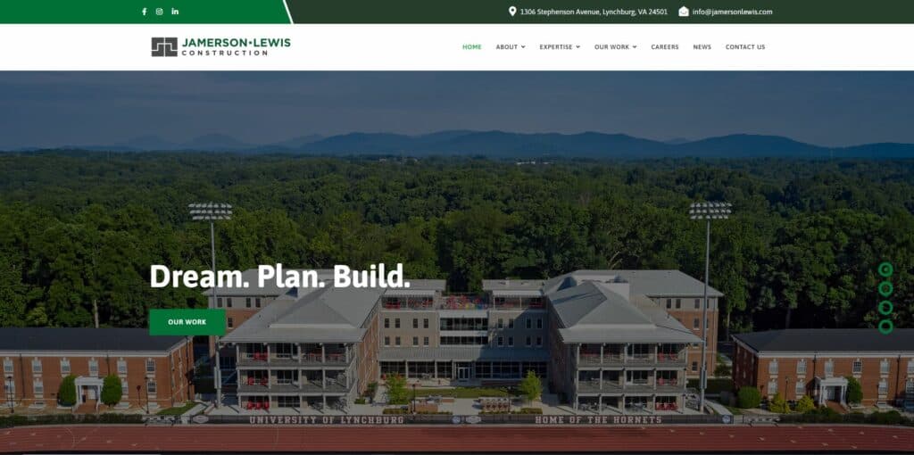
I’m not typically a fan of sliders on the hero section but the Jamerson Lewis Construction website has managed to put one together quite tastefully. The images and text fade gently into the next slide so they’re not as jarring as some others that I’ve seen.
I also like their use of different shades of green, especially on the top bar where they’ve used a lighter shade of green to separate their social icons from their contact info. This is a simple, yet effective way of creating separation between elements and it looks amazing.
Their navigation is clean and the information they provide on their homepage is well structured. You definitely get the feel that this company is organized and would be easy to work with.
The hover animations on their buttons and images are a nice touch and the photos they have of their previous work are high quality. This is by far one of the best construction company websites I’ve seen, even outside of the Lynchburg area.
- This site is powered by Stimulus.
- Visit Jamerson-Lewis Construction.
#5 Millie’s Living Cafe
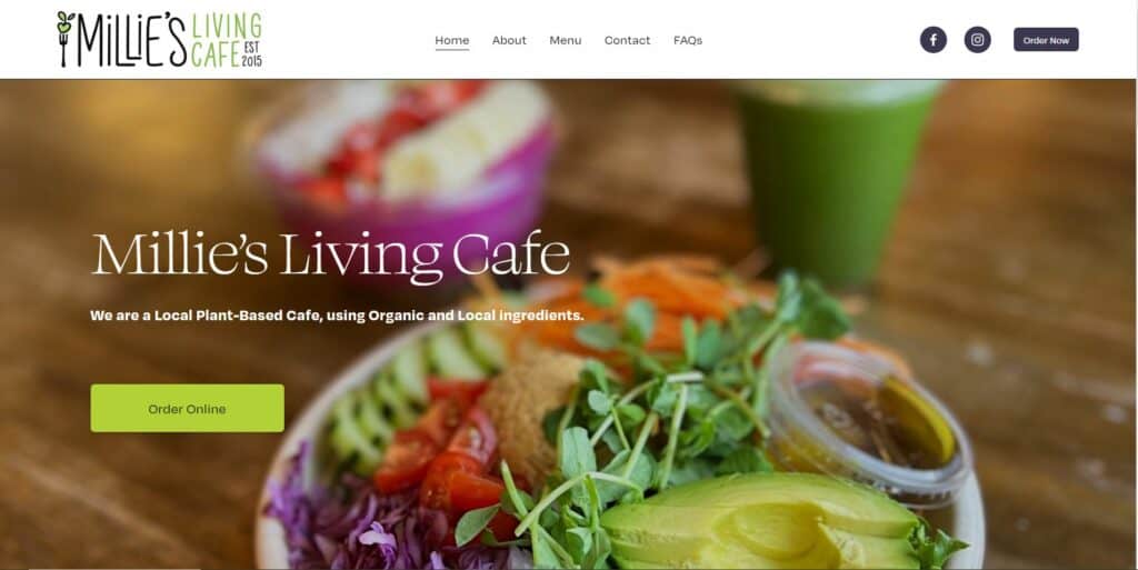
What I love most about this website is its simplicity. They’re not trying to go over the top with crazy design elements and animations. It’s just simple, clean, and it works.
The image of one of their plant-based dishes in the hero section is perfect as it immediately demonstrates the type of food they offer. One thing that could be improved here is the text within the hero section itself. In my opinion, Millie’s Living Cafe should be removed altogether, and the text beneath it should be made larger.
I love how they’ve chosen a shade of green that resembles that of an avocado. Being that this is a plant-based cafe that serves clean, organic dishes this makes total sense. Their font selection couldn’t be better and their use of shape dividers is something I often use on my site builds as well.
While this site may be small compared to some others on the list, its clean and simple design is by far one of the best in Lynchburg when it comes to restaurants and cafes.
- Visit Millie’s Living Cafe.
#6 Central Virginia Flooring
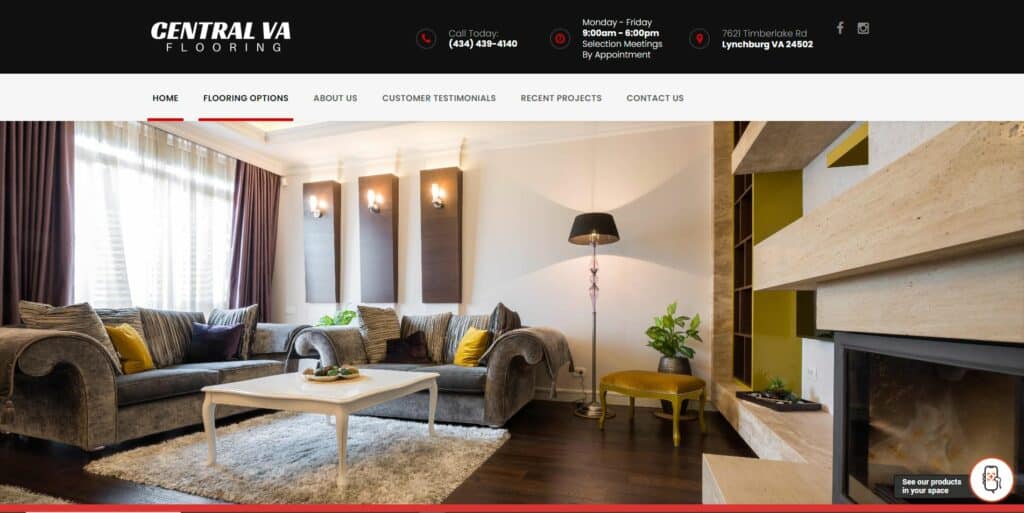
What immediately stands out to me on this website is the image they’ve used in the hero section. It looks high-end and luxurious and really helps you get a feel for the types of products they sell.
Their navigation is clean, they’ve got a click-to-call button in the top bar which is nice, and they’ve got lots of relevant images throughout the homepage.
Another feature on this site that I thought was nice is the widget they have that allows you to see their products in your home. You can access it by clicking a button in the bottom right-hand corner of the screen. However, I think this feature deserves a more prominent spot on the homepage, perhaps a section all to itself. Being that this feature is designed to increase the likelihood of people purchasing their products, it should be displayed in a way that’s not likely to be missed. On mobile it’s easily seen, but I almost completely overlooked it on desktop.
Another issue I found with this site is that it’s not as mobile-friendly as the rest on the list. It still functions fine but it could definitely use some optimization as it looks way better on desktop than it does on mobile.
- Visit Central Virginia Flooring.
#7 Fisher Construction & Excavation
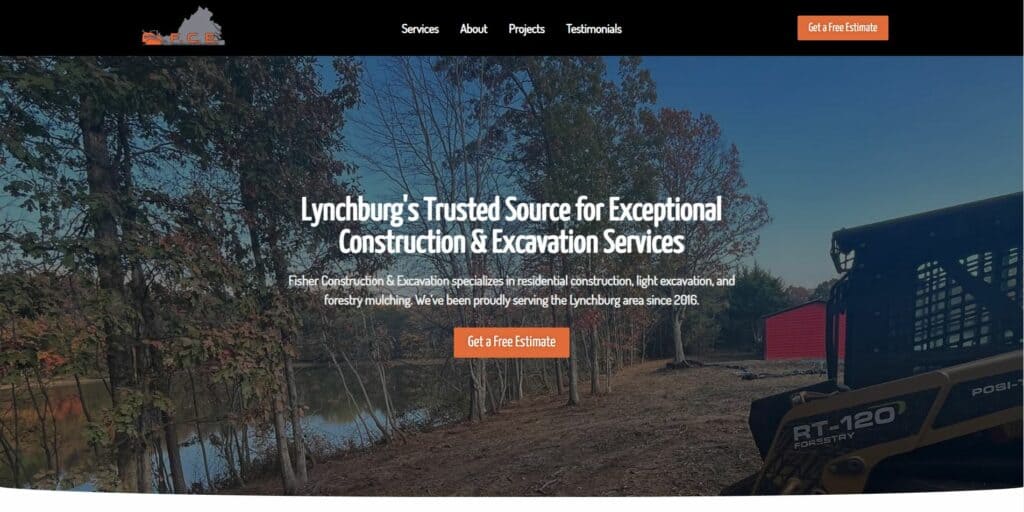
Last on the list is Fisher Construction & Excavation. This site was built by yours truly so forgive me if I’m slightly biased towards it!
Like Millie’s Living Cafe, this website is clean and simple. It has a clear and straightforward layout that helps users find the information they need without feeling lost or overwhelmed.
I like the use of large images in the “What We Do” and “Who We Are Section” for two reasons. The first is that they provide users with a real sense of what the company does and who they’ll be working with. The second is that they help differentiate these two sections from one another. The gallery towards the bottom of the page is also nice as it allows users to view different images based on the type of work they’re looking to have done.
This website also has a testimonial section which is essential for business websites like this one and it has a clear CTA. With regards to responsiveness it’s fully optimized for desktop, tablet, and mobile devices and looks flawless on all of them.
Overall this site has a great look and feel, is user-friendly, and does everything that Fisher Construction & Excavation needs it to.
- This site is powered by Take Five Digital.
- Visit Fisher Construction & Excavation.
Final Thoughts
As we’ve seen, Lynchburg’s best business websites are more than just online platforms; they’re digital works of art that combine exceptional design skills and functionality. Each website we’ve visited has done an excellent job of reflecting the character and essence of its respective business. These websites play a crucial role in enhancing Lynchburg’s online presence and engaging its community. They demonstrate the importance of a strong online representation for small businesses in today’s digital age.
If you think you’re business website deserves to be on the list, I’d love to hear from you. Or, if you’d like me to audit your website I’d love to do that as well. Feel free to contact me anytime.
Thanks for reading, and God bless.

