
Picture this: you’re on Google looking for the perfect orthodontist in Lynchburg. You find one with plenty of 5-star reviews so you decide to check out their website only to see that it hasn’t been updated since it was created when dial-up was state of the art.
It’s quite off-putting, isn’t it?
Behind those local search results are dozens of websites just like the one I described. Surprisingly, tons of local small business owners don’t see the value in having a custom, well-designed, modern website. This isn’t the case, however, with Bates Family Orthodontics.
In today’s blog post, we’re going to take a look at the Bates Family Orthodontics website and highlight what we like about it, what we don’t, and what could be done to improve it.
Let’s get started.
The Header

The header section of this website is pretty standard. They have the logo on the left and the menu on the right. Today’s web browsers have come to accept this layout as normative so keeping things in line with their perspective is always a good thing. We don’t want site visitors to have to search for what they expect to be in a certain place, so good job there.
I would suggest adding a bit more spacing between the phone icon, the CTA button, and the hamburger menu as it looks a bit cramped on desktop. On mobile, however, everything looks perfect.
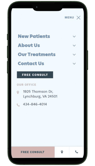
The menu itself is hidden behind a hamburger icon on both desktop and mobile. While I don’t feel that this was necessary on desktop since they don’t have a massive menu, it still looks fine and functions as it should.
On mobile, the header section looks great. The hamburger icon opens up to a full screen menu that includes a clear CTA button, a phone icon that allows you to click to call, and a map icon that opens up Google Maps for you when you click it.
All of these features make things really convenient for site visitors when trying to schedule a consultation or take the next step.
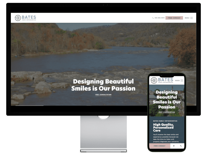
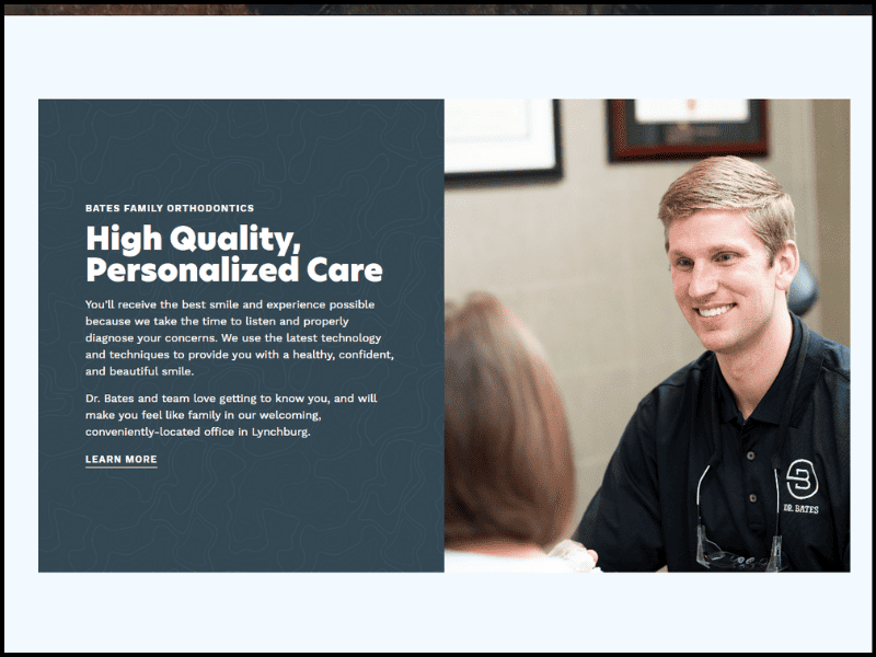
The Hero Section
Moving down to the hero section you’ll see a full screen video background and their H1 title which says “Designing Beautiful Smiles is Our Passion”. I love the fact that this title is relevant, personalized, and isn’t cliché. It speaks to what they do as professionals and it resonates directly with their target audience.
What I don’t like about this hero is that the video background is completely irrelevant. Instead of an image or video of people smiling, or orthodontic work being performed, we have drone footage of Lynchburg. It comes across as more of a travel website, or what could be Lynchburg City’s official website than it does an orthodontics office.
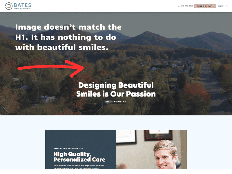
I would highly recommend changing out this footage for an image or video that’s more relative to your target audience.
Body Content
Next, we have a few sections of body content. These sections are geared towards providing would-be clients with important information such as:
- the benefits they’ll receive from working with Bates Family Orthodontics
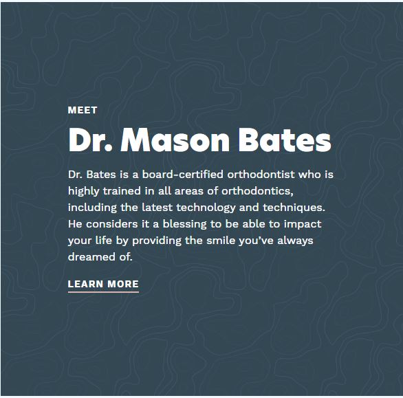
- who they’ll be working with
- types of treatments available
This website does a great job of providing relevant information to its site visitors in a clear and well organized way. The way they’ve structured their content makes them look professional, modern, and trustworthy, but also approachable. They’ve done a great job of communicating who they are, what they do, and why they should be chosen over other orthodontists in the area.
Job well done!
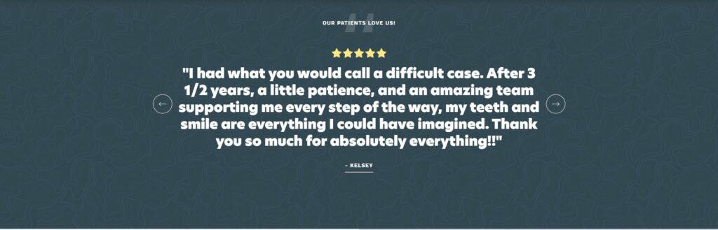
Social Proof
One of the best things any service based business website can do to increase its chances of converting is to have testimonials right on the home page. Why? Because people are more likely to buy something or pay for a service when it’s been tried by someone else first with a good result.
This website takes advantage of that fact and has a beautiful testimonial carousel towards the bottom of their homepage complete with multiple reviews and 5-star ratings.
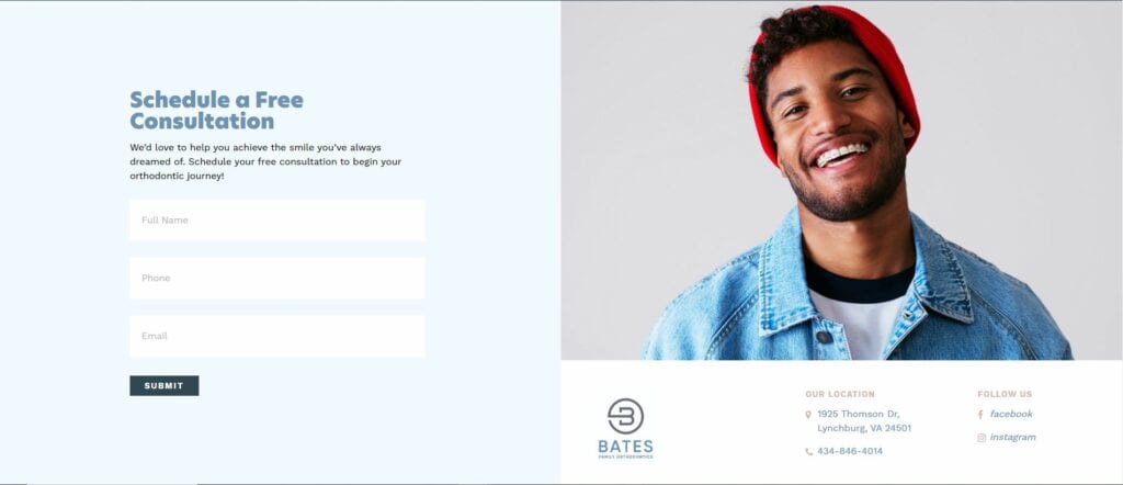
The Call to Action
At the bottom of the page is the CTA or call to action. This is where you tell your site visitors what you want them to do next. In the case of Bates Family Orthodontics, it’s to reach out to them to schedule a free consultation.
I love how they’ve included an image next to their CTA of someone smiling with braces. Like their H1 title in the hero section, this image appeals directly to their target audience. It communicates a feeling, or benefit that’ll be received if you decide to work with them. This is the type of image I’d like to see in their hero section.
Design Features
There are a few design features that I really like on this website. The first is the video background in the hero section.
Video Background
Aside from the irrelevant imagery, the video background is more dynamic than just a static picture. Videos have a way of helping us connect more so than text or images do. I love the fact that they’ve incorporated video into their website and I just hope that at some point they’ll put a more relevant one on there.
Any time you can put a video on your website without it destroying your site speed, go for it!
Consistent Fonts & Colors
Using consistent fonts and colors on your website makes you look organized and professional. Nobody wants to try to read 8 different fonts in lime green, yellow, and maroon. It looks and feels amateurish. The font combination and color scheme used here make the content easy to read and look at.
The patterns they used behind these darker blueish areas are a nice touch and are a great way to break up a space.
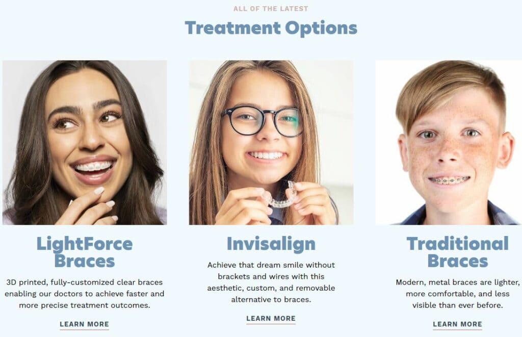
Relevant Images
This website has also done a great job of incorporating relevant images on their homepage. In their “Treatment Options” section they have an image of someone using each type of braces they offer. Having an image associated with your product or service helps people visualize what it is that you’re selling and how their lives could be improved if they bought it.
Performance
Having a site that loads quickly is a must for modern businesses. Statistics show that 46% of users won’t revisit a website that performs poorly. Plus, page load speed is a ranking factor. Meaning that you stand a better chance of ranking higher in Google search if you have a fast website.
I ran this website through Google’s Page Speed Insights and got the following results.
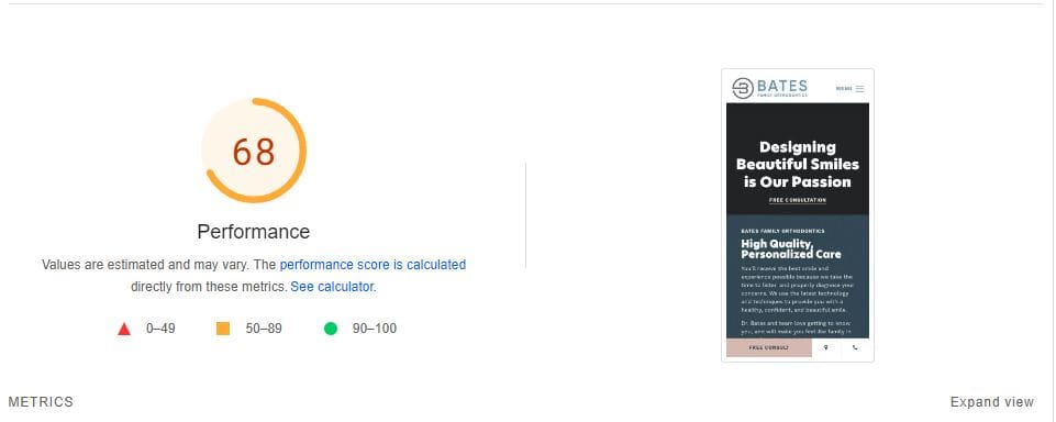
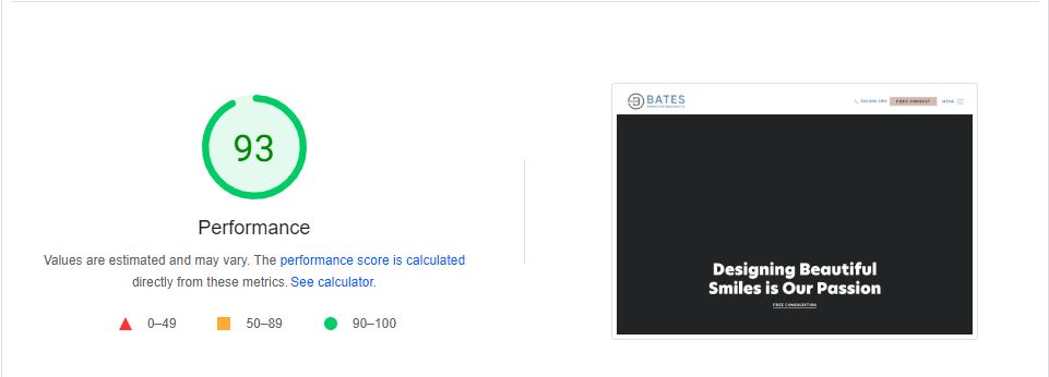
A performance score of 68 on mobile and 93 on desktop is fairly average.
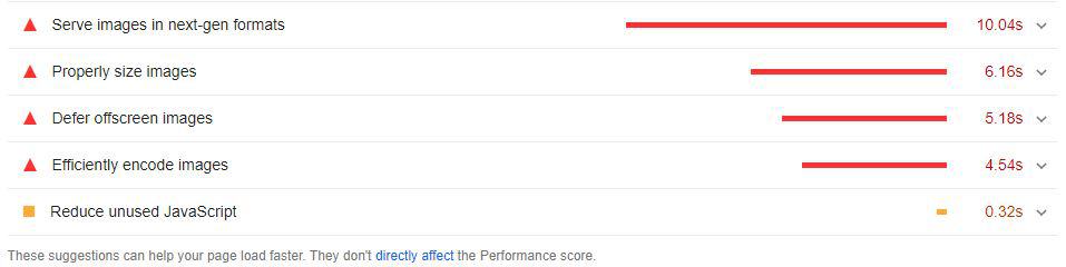
This site could load significantly faster if they resolved the issues listed by Google in the image above. Serving images in next-gen formats, properly sizing and efficiently encoding them could all be addressed by using a plugin like Shortpixel. Deferring offscreen images could be done by using a lazy-load plugin. Some caching plugins have the lazy-loading feature built into them as do page builders like Elementor.
Fixing these issues could be done in less than an hours time. That being said, I’d definitely make the effort to address these problems as doing so will enhance your site visitor’s experience and give you a boost in SEO.
Final Thoughts
If I had to give this website a star rating it would be an 8 out of 10. The fonts, colors, modern design, relevant imagery, and video elements are all reasons why I like this site so much. The convenience features such as the click-to-call button and prominent CTA’s are also nice. Overall this website has a great look and feel and I don’t see any fatal flaws in its design other than the footage that was chosen for the hero section.
Performance wise, the site is on par with most others. It could definitely be improved by implementing the changes mentioned above. I’d be really curious to see the new Page Speed Insights score for mobile after making these adjustments.
This is definitely one of the best orthodontists websites in the Lynchburg area and with a few small tweaks, I’d consider it THE best. Great job!
Want to check out the Bates Family Orthodontics website for yourself? Click here.
The Bates Family Orthodontics website is hosted by Stimulus.

